What’s New in Squarespace 7.1
You may have heard some buzz about Squarespace’s latest update.
I’ve been playing around with the idea of starting a new blog about minimalism and other personal interests, I decided to just jump in to Squarespace 7.1, before researching anything, and share a fresh walk-through with you here. If you’ve created websites using the previous iterations of Squarespace, read on to see the changes and save some time where I got lost.
What’s changed
Site Export
I hope that Squarespace reconsiders this, but you can no longer export your content in 7.1, if you’d like to move your site elsewhere. (Or move it back to Squarespace 7.0 or just take it offline.) Of course you can copy and paste and download all of your content, but for anyone with a blog or products or many pages, this would be time-consuming. It certainly raises my eyebrow about the ethics of not allowing content creators and businesses the ability to quickly access their full content. If this is a concern, here’s the link to the 7.0 templates.
Templates
The website mock-ups on the Template page are all the same template family now, so it doesn’t really matter which one you pick, if you are planning to design the website from scratch.
(If you aren’t a designer, scroll through the examples, and take some time to find the one that is closest to the look, feel and layout you want to save time on making changes later. You can also click “Get Started” where you’ll head to a series of simple questions about your project, which will sort the available templates.)
Main editing window
The pop-ups that allow you to edit your pages are gone, but you can still edit your website. Don’t panic!
It took me a minute (or, umm, a few) to figure this out, but you need to click “EDIT” in the top bar to edit your site. This is opposite, in a way, from the old set-up, where you can’t edit if your site is in the fullscreen mode. (*Fullscreen preview has moved to the right hand side of the menu bar.)
They got rid of the tiny arrow to move between previewing and editing your site, which is replaced with a bar that says “Edit” and “Done.” (I’m happy the tiny arrow is gone, as it was hard for new users to find sometimes.)
There’s no more roughly-tablet width preview at the top. (I always suggest changing the width of your browser through all to see how it may look on any view, anyway.)
Pages Panel
This is about the same, but with a minor update to the icons.
Gallery Pages are now Gallery Sections
There aren’t gallery pages in Squarespace 7.1, but the new gallery sections are really great, and they can be designed to look like all of the previous gallery pages, except the slide gallery.
Cover Pages
Cover pages are gone in 7.1. I hope Squarespace brings them back, as it’s a handy feature for promotions or special events.
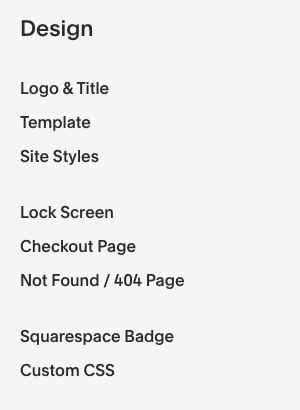
Design panel
Big changes on the design panel!
“Logo & Title” are completely gone from the panel.
You need click “EDIT” on the top bar, then hover over your header area on your website, and then a pop-up window will give you options for uploading your logo, changing layout and styling your header.
“Template” is gone, as there isn’t a reason to switch in 7.1
The “Site Styles” have been broken into their individual parts, and are now directly in the panel.
This is much more organized and user-friendly!
The “Fonts” section how has a series of font packs that their designers have come up with. You can edit them to create your own font pack by clicking the settings gear icon.
The “Colors” section has also gone through a great update. You can pick a main color, and this section generates a palette based on it. You can also select from their designer-generated palettes, or add in your own colors using a hex or hsl code, if you are a designer, want to play with colors, or you had a designer create a palette for you. After you’ve decided on your palette, you can pick a theme. You can also click the pencil icon, which will take you to the Squarespace 7.0-style design panel to change each element.
The “Buttons,” “Spacing,” “Product Items” and “Image Blocks” sections take you to the 7.0 style-editing windows. I found a big welcome surprise here, though! You can finally edit all of the elements, even if they’re not on the page. For example, in 7.0, if you wanted to style a button, you had to be on a page that had a button on it, which was rather frustrating when setting up an overall design.
One disappointment with the “Buttons” panel, you can no longer style the small, medium and large buttons separately without using CSS.
The other sections are pretty much the same.
Editing Pages
One big change here, as well.
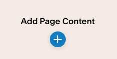
You can now add sections to any page, using the blue plus button. This allows you to easily add a full-screen background image to just one part of any page. Beyond that the sections are basically pre-designed layouts.
Once you have created a section, adding blocks, moving them around and editing is the same.
So, what’s the deal?
There are a few major interface changes, mostly in the design panel, but I’ve ended up viewing Squarespace 7.1 almost as a new, very flexible, template.
As of now, there’s no reason to rush to change your website over to 7.1, unless you want to take advantage of the Section options, which makes it much easier to add background colors and full screen images to particular pages or specific parts of your pages, without using CSS.
If you want to be sure your site is easy to export, stick with 7.1.
I’ve also made a list of a few things that are no longer available in the 7.1 template. Check that out here.
WHAT’S NEW IN SQUARESPACE 7.1
By Nicole Bemboom


