Email Accessibility: Where is the text?
This post is part of our series Emails for Everyone. Find the entire ongoing exploration here.
Where is the text?
I’ve been noticing a lot of email newsletters and promotions coming my way (from companies with great missions and design that I adore) that are built only with images… without any text at all.
In these emails, there is text placed on an image or graphic file, but it’s not included as actual text in the email. So without the image, the text is unreadable for someone using a screen reader. Web accessibility best practices require that your webpage is built to work well with a screen reader, so I’m not sure why this is falling off in email design.
Below is a graphic that demonstrates text included as an image. Some people are able to read the message below, but if you only have the text like this, saved in an image file (on the web, or in an email) without actual text to accompany it, it will just be blank for those using a screen reader.
So, where is the text?
There are many reasons that someone may not be able to or want to read or interact with an HTML or image-based email. (I’ll cover this in the future.) But, for this exploration, let’s focus on accessibility for someone who is visually-impaired and uses a screen reader for their email.
Most email marketing programs have the option of sending an HTML version of an email, and a plain text version of an email. Yet, in both Gmail and Apple Mail, so far I can’t find the plain text version. (Next week will be devoted to getting to the bottom of this.)
*Note from the future: There is no good way to view the plain text version through Apple or Gmail. Skip ahead here if you want to see how I got to the bottom of this.
If you want to experience this firsthand, try turning off your email images for a while. (Usually easy to do, just Google your mail client and “disable images”.)
If you use Gmail, navigate to settings and select “Ask before displaying external images” in the Images section.
An example of an image-only email
I’ve been doing this for the last few months, and so many of my incoming emails are simple a subject line and a completely blank message body. I’m including some examples of what I’ve been receiving, but I’ve blurred out the company details. My intention isn’t to shame anyone at all, but I do want to show what emails look like without the images.
That’s it. Just a subject line, and an unsubscribe link.
The version with images is shown to the right.
It’s a beautifully designed layout, with a lot of text placed on the image, and not placed in the body of the email, as you can see above.
If you’ve ever worked with email design, you’ll know that it’s impossible to create a layout that is this nice, or even close. You’re really rather limited by the ways that email apps display emails (and also because you need to design for the wide variety of email apps, all with their own quirks and limitations.)
But the trade-off can’t be that we exclude people to create a more appealing look for a single group.
I’m going to reach out to companies who send their emails as images, and ask if they have a Plain Text version, or if they have any other way that they are addressing accessibility. I’m hoping there is a way that these email have been accessible all along, and I just can’t find anything about it.


This slideshow shows a handful of the emails I’ve received recently. The with “image view” of these emails all include images with text of announcements or product features, information that is cut from this version.


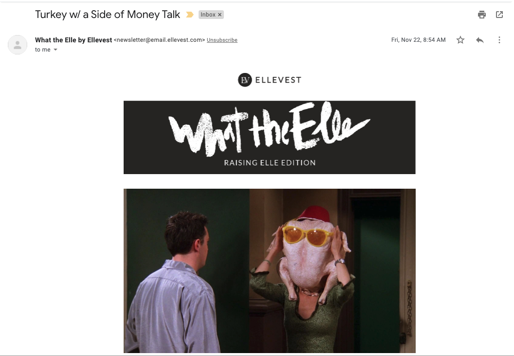
a newsletter that’s doing it right: “What the Elle” and Ellevest
Since turning off my images, I’ve actually found one newsletter that I like even more without images than with the images.
Ellevest’s “What the Elle” newsletters are always a joy to receive and all of the text is included in the body of the email, so they are built for accessibility. (Go, Ellevest!) But was a fun surprise to find out what they do with their alternative text for their images. (Alternative text is the text that shows up instead of an image, or is used by a screen reader to explain the image to someone who isn’t receiving the image as an image.)
You don’t miss anything without the image. The image is described well, and with the note about the “enviable houseplant” (so hot right now!) a person receiving this email without images gets an additional dose of humor that you miss with images on. That’s taking accessibility, inclusion and meaningful content to the next level!
(Just a few more examples.)
So, sign up for Ellevest’s newsletters and join me next week when I’ll share my findings on whether the emails that are only images are accessible in some way.
Email Accessibility: Where is the text?
By Nicole Bemboom


